728x90
시계열 데이터는 관측치가 특정 시간 간격으로 기록되는 데이터를 의미합니다. 이런 시계열 데이터에는 다른 유형의 데이터와 구별되는 몇 가지 특정 특성이 있습니다.
- 시간 종속성(Time Dependence): 시계열 데이터는 시간을 기준으로 정렬되며 데이터 포인트의 순서가 중요합니다. 각 관찰은 이전 관찰과 미래 관찰에 따라 달라집니다.
- 계절성(Seasonality): 많은 시계열이 계절성으로 알려진 반복 패턴 또는 주기를 나타냅니다. 이러한 패턴은 매일, 매주, 매월 또는 매년과 같이 고정된 간격으로 발생할 수 있습니다.
- 추세(Trend): 추세는 시간 경과에 따른 데이터의 장기적인 움직임을 나타냅니다. 증가, 감소 또는 정지(일정)할 수 있습니다.
- 노이즈(Noise): 노이즈는 특정 패턴이나 원인에 기인할 수 없는 데이터에 존재하는 임의의 변동을 의미합니다.
- 자기상관성(Autocorrelation): 자기상관성은 데이터 포인트와 지연된(이전) 관찰 사이의 관계를 측정합니다. 연속된 데이터 포인트 간의 유사도를 나타냅니다.
이제 합성 시계열 데이터를 생성하고 이러한 특성을 시각화하는 Python 예제를 만들어 보겠습니다.
우선 추세, 계절성, 노이즈로 시계열 데이터를 만들고 시각화해 보겠습니다.
import numpy as np
import pandas as pd
import matplotlib.pyplot as plt

# Generate synthetic time series data
np.random.seed(42)
num_points = 100
time_index = pd.date_range(start='2023-01-01', periods=num_points, freq='D')
trend = 0.1 * np.arange(num_points)
seasonality = 10 * np.sin(np.linspace(0, 4 * np.pi, num_points))
noise = np.random.normal(loc=0, scale=2, size=num_points)
time_series_data = trend + seasonality + noise

# Create a DataFrame with the time series data
df = pd.DataFrame({'Date': time_index, 'Value': time_series_data})

df=df.set_index('Date')

# Plot the time series data
plt.figure(figsize=(10, 6))
plt.plot(df, label='Time Series Data', color='blue')
plt.xlabel('Date')
plt.ylabel('Value')
plt.title('Synthetic Time Series Data')
plt.legend()
plt.grid(True)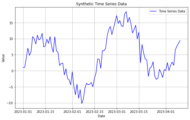
시계열 데이터는 이렇게 DatetimeIndex를 가지고 데이터 포인트의 순서가 중요합니다.
이제 이 그래프에서 추세, 계절성, 잔차를 분해해서 그려보겠습니다.
# Decompose the time series data into components (trend, seasonality, and residuals)
from statsmodels.tsa.seasonal import seasonal_decompose

decomposition = seasonal_decompose(df, model='additive')

trend_component = decomposition.trend
seasonal_component = decomposition.seasonal
residuals = decomposition.resid

# Plot the decomposed components
plt.figure(figsize=(10, 6))
plt.subplot(3, 1, 1)
plt.plot(trend_component, label='Trend', color='red')
plt.ylabel('Trend')
plt.legend()
plt.grid(True)

plt.subplot(3, 1, 2)
plt.plot(seasonal_component, label='Seasonality', color='green')
plt.ylabel('Seasonality')
plt.legend()
plt.grid(True)

plt.subplot(3, 1, 3)
plt.plot(residuals, label='Residuals', color='purple')
plt.xlabel('Date')
plt.ylabel('Residuals')
plt.legend()
plt.grid(True)

plt.tight_layout()
plt.show()
여기서 잔차(Residuals)는 시계열 데이터에서 추세(Trend)와 계절성(Seasonality)을 제거하고 남은 데이터를 의미합니다.
자기상관성은 현재값과 지연값(어제, 그제, x일 전 등) 사이의 상관관계를 의미합니다. 간단히 말해 과거의 데이터가 현재에 의 데이터에 영향을 주고 있음을 의미합니다. 자기상관성은 ACF(자기 상관함수)를 통해 시각화할 수 있습니다.
import numpy as np
import pandas as pd
import matplotlib.pyplot as plt
from statsmodels.tsa.seasonal import seasonal_decompose
from statsmodels.graphics.tsaplots import plot_acf

# Generate synthetic time series data (same as before)
np.random.seed(42)
num_points = 100
time_index = pd.date_range(start='2023-01-01', periods=num_points, freq='D')
trend = 0.1 * np.arange(num_points)
seasonality = 10 * np.sin(np.linspace(0, 4 * np.pi, num_points))
noise = np.random.normal(loc=0, scale=2, size=num_points)
time_series_data = trend + seasonality + noise
df = pd.DataFrame({'Date': time_index, 'Value': time_series_data})
df=df.set_index('Date')

# Decompose the time series data into components (same as before)
decomposition = seasonal_decompose(df, model='additive')
trend_component = decomposition.trend
seasonal_component = decomposition.seasonal
residuals = decomposition.resid

# Plot the ACF of the residuals
plt.figure(figsize=(10, 6))
plot_acf(residuals.dropna(), lags=20, zero=False)
plt.xlabel('Lag')
plt.ylabel('Autocorrelation')
plt.title('Autocorrelation Function (ACF) of Residuals')
plt.grid(True)
plt.show()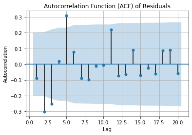
이 그래프에서 자기상관성은 음 또는 양의 상관관계를 가지고 있고, 대부분이 신뢰구간 안에 분포하고 있음을 알 수 있습니다.
자 이렇게 간단하게 시계열 데이터의 특징에 대해 알아보았습니다.
※ 전체 소스는 여기에:
728x90
'데이터분석과 AI > 데이터분석과 AI 일반' 카테고리의 다른 글
| 실전 시계열 분석-Practical Time Series Analysis 리뷰 (0) | 2023.08.23 |
|---|---|
| 부동소수점 이란? 부동소수점 계산 방식에 따른 오차 발생 예제 (0) | 2023.08.08 |
| 회귀분석과 시계열분석의 차이 (2) | 2023.08.02 |
| 데이터 역량을 키우는 방법 - 공공기관 데이터 역량강화 가이드라인 (1) | 2023.07.25 |
| Bard 출시!!! ChatGPT vs Bard 승자는? (0) | 2023.04.28 |


댓글